The Metropolitan Transportation Authority (MTA) has officially introduced a newly redesigned subway map for New York City, marking its first complete overhaul since 1979.
The updated map, now visible on digital screens across the network and gradually being installed in subway cars, is intended to offer clearer navigation and improved accessibility.
The new map adopts a diagrammatic format with bold, straight lines and a simplified design. The updated layout aims to enhance readability, particularly on digital platforms, while maintaining the essential route and transfer information used by regular and occasional passengers alike.
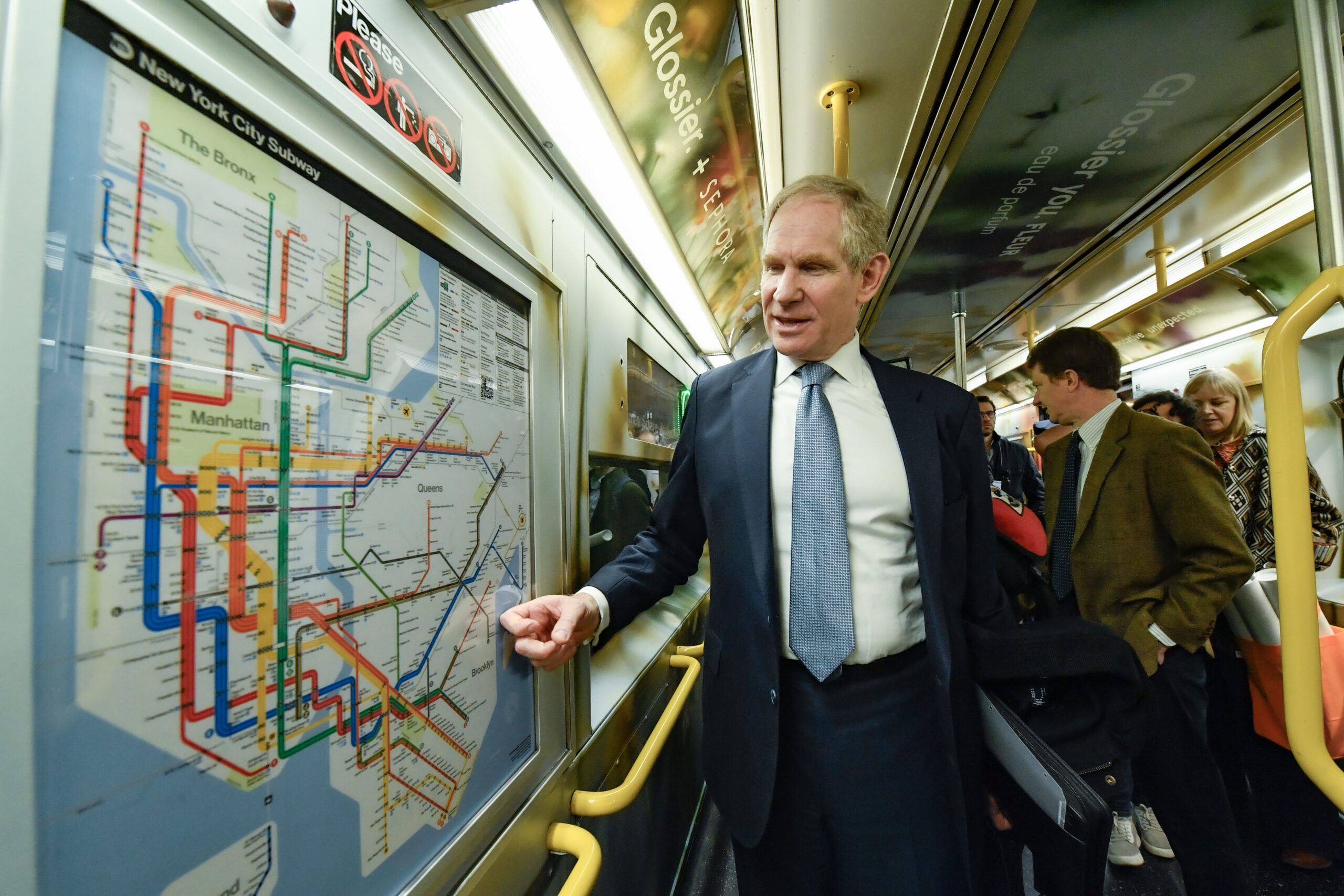
Designed by the MTA’s in-house Creative Services Mapping Department, the map features a white background, high-contrast colours, and improved text legibility. Black route bullets with white lettering provide greater visual clarity, and the placement of text has been revised to reduce crowding and confusion. Where possible, names now appear on a single line.
Accessibility features are more prominently displayed, with black dots denoting accessible stations and an updated legend that includes information about transfers, station features, and a QR code linking to further details online. The changes reflect the MTA’s continued focus on making the network more inclusive for riders with limited mobility or visual impairments.
The redesign coincides with broader updates to customer-facing technology across the system, including enhanced station signage and digital screens that now refresh every five seconds to provide more frequent real-time service information.
New York City Transit President Demetrius Crichlow said:The subway map is both an iconic symbol of New York and a tool that everyday riders and first-time users of our system use to get around. This modern redesign makes it easier to navigate the system – especially during service changes – and has a quintessential New York look that riders will appreciate for years to come.
The new design also draws on elements from earlier versions of the subway map. It retains the established colour scheme introduced in the 1979 and 1998 Hertz maps and maintains a diagrammatic approach inspired by Massimo Vignelli’s 1972 design, later revisited by Waterhouse Cifuentes.
In addition to physical and digital rollouts, the MTA is updating overhead displays in stations to include directional arrows indicating the platform side of approaching trains. Alerts, both visual and audible, will be more frequent, while new stickers will help passengers distinguish between travel information and advertisements on shared screens.
MTA Chair and CEO Janno Lieber said:The new MTA is focused on a quality, 21st century customer experience, and its about time our map caught up. The new version is much easier to read while also reflecting all the enhancements we’ve made over the years.
The rollout of the new map will continue throughout 2025. It will appear on the newest R211 subway cars and replace older physical maps in existing vehicles over the coming weeks. Both the new and previous versions will remain available on the MTA’s website.